
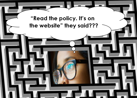
Do you think that your writing is accessible to people who are dyslexic?
If so, you may be wrong.
The good news is that many habits are easy to change. This article tells you how.
Do we need to make our writing accessible?
The Equality Act 2010 created an ‘anticipatory duty’ to make reasonable adjustments. That means you should fix issues for disabled people that you can reasonably predict.
The British Dyslexia Association indicates that 10% of adults are dyslexic. Meanwhile, the National Literacy Trust believe that 8 million adults in the UK have a reading age of 11 or below.
Because so many people are affected by dyslexia, you can reasonably predict that you’ll need to make your writing accessible to dyslexic people.
These eight tips will help you enhance the readability of your writing.
1. Accessible Fonts
A serif is a small decoration to finish off letters. Serif fonts include these decorations. The extra detail makes the fonts less readable. Therefore, avoid serif fonts such as Times New Roman.
Instead choose a sans-serif font.
Sans-serif means “without serif” and so there is no decoration that makes the font less readable.
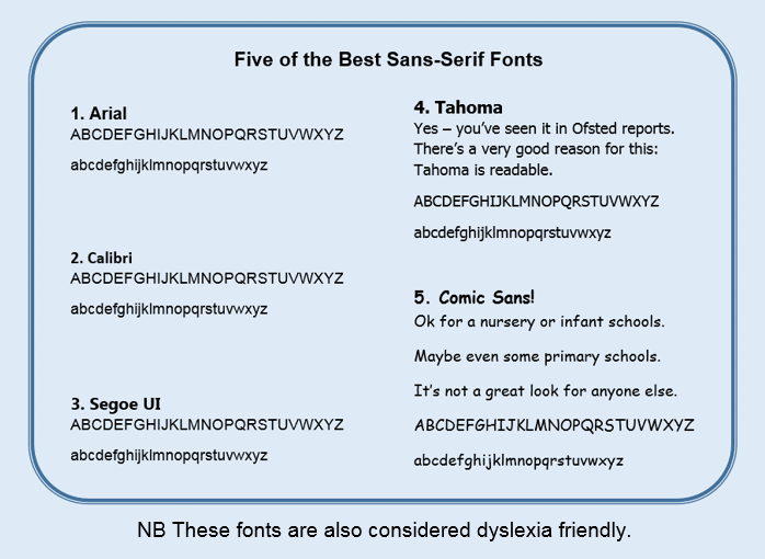
Some schools use cursive fonts (that look like handwriting). However, these are harder to read and make an extra barrier.
Should you use cursive fonts in your documents? The answer is simple: No.
2. More accessible font tips
These tips are ‘quick wins’ as they need little effort.
- Bold: Yes. It highlights key info and is more legible.
- Underline: No. It’s harder to read.
- Italics: No. It’s harder to read.
- Size: 14+ for headings. 11 for your main text.
- Line spacing: Use 1.2x so that words are less crowded.
- Align: Left
3. Choose colours carefully
Choose a good colour contrast. This means:
- Dark text on a light background, or
- Light text on a dark background.

Bright colour combinations can make text uncomfortable to read. Many such combinations are uncommon because they are ugly. That makes them easy to avoid.
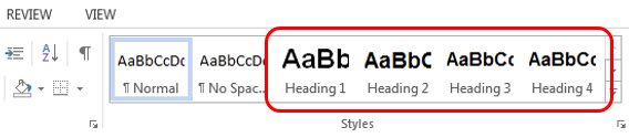
4. Use accessible headings
Microsoft Word has Headings. Use them.
We all come across parts of documents that are relevant to us. We generally skip forward to find the next section of interest. Headings help us, and your reader to do this.
As an extra benefit, they also add code to help blind people skip between your sections.
Always use Heading 1 for your main title. Then use Heading 2 & 3 for subheadings depending on how important the subheading is. You will not need Headings 4+ unless writing a complex document.
In Word, you’ll find headings in the Styles section:
Headings come with pre-loaded fonts. These are easy to change. Just right click on your Heading 1, 2, 3 etc and click ‘Modify’:
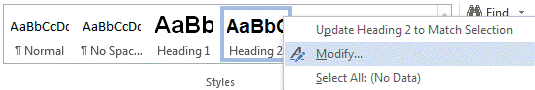
Once you click modify, pick your font, colour, size and bold.
This will automatically update the style of all headings of the same type. Always begin with Heading 1 and then work down the hierarchy in order.
5. Block capitals are not accessible
When whole words are written in capitals, readers cannot recognise the word by its shape. Instead they have to read every letter. This slows your reader and can frustrate them.
Capitals are commonly misused in titles and subheadings. These should not be in capitals, even if the document is important.

Capitals are only needed for acronyms (e.g. SEND, OFSTED, LGBTQ+).
If you have Word documents that have misused capitals, highlight your problem words. Then hold down shift and repeatedly press the F3 key until the word changes to the lower case style needed.
6. Use common words
You want your reader to understand what you have read. Dyslexic readers often find processing words difficult. So use words that are most familiar.
You write to get your message across. So, keep it as straightforward as possible by using common words.
Example word Common word
amendment change
additional extra
commence start
facilitate help
sufficient enough
statutory legal
7. Keep sentences short
The longer the sentence, the less people understand.
When writing for the public, UK government has a rule – no more than 25 words in a sentence.
When your average sentence is 14 words, people understand 90% of what they read. At 43 words, this falls to 10%.
UK government publishes some ‘rules of thumb’ about sentences:
- 11 words = easy to read
- 21 words = fairly difficult
- 25 words = sentences become difficult
- 29+ words = very difficult.
This is a wake-up call. When your information is very difficult, readers skim past important details or abandon the whole text.
Dyslexic people often have difficulty processing information. So, when you write long sentences, you make it especially hard for them.
Even with shorter sentences, avoid paragraphs that are more than 5 lines long. Do not create walls of text.
8. Tautology: No, No, No
Tautology is using extra words that add no extra meaning. These words make your sentences longer, but add little detail (if any).
Examples by schools include:
- Future plans (plans are normally in the future)
- Past history (how often is history not in the past?)
- Support as relevant (when would we provide irrelevant support?)
Examples in this article include:
- Tautology: No, No, No.
- Tautology is using extra words that add no extra meaning. These words make your sentences longer, but add little detail (if any).
If extra words add no further detail, you make text harder for your dyslexic reader.
Summary
- Use headings (size 14+ in bold text).
- Avoid capitals, underlining and italics.
- Use sans serif font (size 11 for your main text).
- Use font colours that have good contrast with the background.
- Choose common words.
Finally, write shorter sentences and break up paragraphs.
Writing for dyslexia: Schools and accessibility plans
In late 2025, the Department for Education announced new guidance on accessibility plans.
This guidance reminded public sector staff, including schools, that they should plan to improve written communication.
Every school can improve how well they communicate in writing with their students and parents. None of us are perfect.
A school does not have time to revisit every document. Staff must prioritise: SEN information is the first step.
Many steps are easy (e.g. switching to a sans-serif font, using size 11, breaking up paragraphs).
Harder steps (like simplifying language) are made easier by using A.I. (for example, “Convert this paragraph to a reading age of 9 years old”).
Other Interesting reads
Take a look at these articles or pick your own.
Need help with inclusion in your council, trust or school?
- Check out our feedback or get in touch.
- To get support to write accessible documents or policies, contact us.
Keep up to date with SEND from 9000 Lives
- BlueSky @9000lives.org
- LinkedIn Aaron-King-Inclusion
